I found these cartograms from an article in the Telegraph and was immediately impressed. The cartograms originated here and use data from the Global Rural-Urban Mapping Project as to create the intriguing images. You can use the map in the previous link to look at any country’s population cartogram, here are a few that stood out to me:
First I would like to show three countries that had their national capitals moved from a heavily populated coastal city, to an inland location.
Istanbul’s historical significance cannot be understated. As Constantinople it was the seat of the Byzantine empire before becoming the capital of the Ottoman empire for centuries. But in 1923, after allies had occupied Istanbul at the close of WWI, newly independent Turkey moved its capital to Ankara.
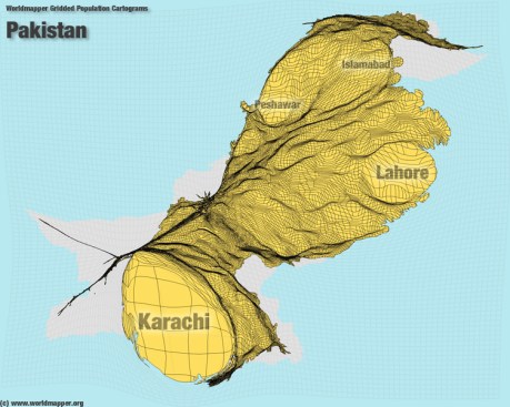
Pakistan’s capital used to be in Karachi but was moved in 1960 to Islamabad. Perhaps this was to disperse the population of Pakistan more evenly, or to protect the government’s critical infrastructure from a naval attack.
For multiple centuries Rio de Janeiro was the capital of colonial and independent Brazil, until in 1960 when the capital was moved to the planned city of Brasilia.
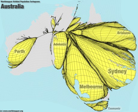
Now I would like to look at examples of countries where populations tend to be focused in one place and are not evenly distributed.
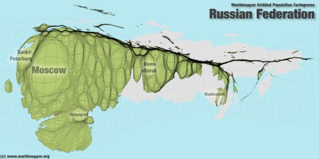
Russia represents a interesting example of a nation having an East-West divide. Geographers often divide Russia along the Ural mountains, with the west often called “European Russia” and the east called “Asian Russia.” 78% of Russians live in the western part of Russia, in about a quarter of the country’s landmass.
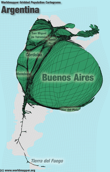
Argentina’s population centers around its capital Buenos Aires and only small nothern cities like Mendoza and Cordoba figure.
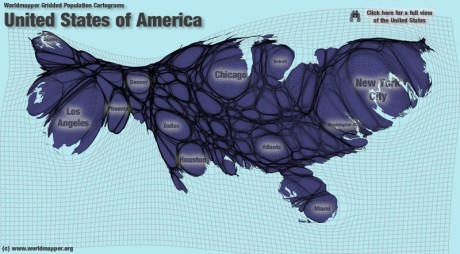
This shows a population trend that’s been observed in the US (to a lesser degree): densely populated coastal cities and an “empty quarter” in the center. I say that this occurs to a lesser degree because the US has many large cities in the midwest and other inland locations:
Another great model for US population density comes from the Times article “Where we live.” The image was created by Joe Lertola:
The US has many big patches of population such as the Acela megaregion (AKA Bos-Wash) which includes everything between Boston and Washington DC. This appears to be the biggest patch, possibly followed by Southern California. Demographers and the like have tried to anticipate growth in the US by grouping large populations into megaregions like Bos-Wash and focusing on infrastructure and land reforms that accommodate these growth trends. One of the most obvious ones is the America 2050 initiative. This group puts out a map of what they consider to be the most important US megaregions in the next 50 years:
Here you can see that the US population isn’t quite as diffuse as the earlier cartogram would indicate. The same group estimates the population of Bos-Wash to be 49 million, or nearly a 5th of the total US population. Overall, this group says a majority of Americans live inside one these megaregions. By 2025 they predict that 75% of Americans will live in these megaregions. the regions themselves are loosely defined; for instance the “Texas Triangle” includes Oklahoma City despite it being nearly 200 miles away from Dallas or any other city in the megaregion. Similarly the “Front Range” region connects Albuquerque to Denver, a distance of 330 miles separates them. If the distance between large populations inside of these megaregions seems daunting, the distances between megaregions is an entirely different beast. Especially in the western US, megaregions are spread very far apart. Separating the “Front Range” from “Cascadia” (my megaregion : ) ) is nearly a thousand miles of mountainous frontier. Maybe the lesson from this map is that the US should focus more on connecting megaregions within themselves instead of paying to connect them with one another. This idea was actually adopted by Obama when he announced plans to build several high speed rail lines in the US. One of the proposed lines would connect Vancouver, BC to Eugene, OR with a high speed rail.
I think its important to note that models showing population trends can help convey the trends that might not be apparent to the casual observer. Once one sees how the population of a country is placed, one can start to ask how it affects policy regarding those trends.




Wow I love your Sperg. I’m a physical geographer/geologist and always appreciated a good map or graph. This site makes some very interesting observations demonstrated so simply and powerfully (if all the “lies, damned lies and statistics” can be believed!).
Thank you for sharing the cartograms. I is interesting to see how much more saturated in population the eastern part of the us is compared to the west.