Archives for posts with tag: Health

Usually I like to post blogs with specific topics, or at least themes that can unify several ideas/datasets coherently. Right now I’d like instead to write a blog with a few interesting things I’ve found recently.

First, I would like to post this graphic showing healthcare expenditure (% of GDP) over a selection of OECD (a rich nation club) members:


This graph was made using Google’s Public Data Explorer and can be found here. I’ll list the values in case you have trouble accessing the link: France 8.7% of GDP on public health, Germany 8%, US and Netherlands 7.3%, Canada 7.1%, and the UK at 6.9%. I think this is a critical graph when discussion on reforming healthcare in the US takes place. As an OECD country, we spend an average amount on public healthcare alone. But what’s not in this graph is our massive expenditure on private healthcare. Data for this was only available for the year 2007, so I made a different kind of graph:

This graph (also from Google Public Data Explorer) shows the real anomaly of healthcare in the US: despite spending a similar amount on public healthcare as other OECD members, we spend much more on private healthcare. This translates into a combined health expenditure of 16% of GDP for the United States. For comparison, here are the combined expenditures for the other members: France 11%, Germany 10.4%, the Netherlands 9%, Canada 10.1%, the UK 8.4%. This succinctly defines problem that some have with the coverage gap in the US which currently leaves ~15% uninsured and produces a very average life expectancy of 78.37 years (50th best in the world). I don’t want to comment further on this debate as I feel it is well covered in the media if you look in the right places.

Moving on, I would like to move on to another recent interest of mine, academic dick waving. There are two publications that I’ve recently found that list eminent academics in two of my favorite disciplines: International Relations and Economics. The first is a survey (you can find here) that examines: “Teaching, Research, and International Politics.”

When respondents were asked “Please list the four scholars who have had the greatest impact on the field of international relations over the past 20 years.” They found:

Some interesting names here, any names you recognize? When asked “What do you consider the top five terminal masters programs in international relations for students looking to pursue a policy career?” they responded:

Again some very interesting schools on the list.

Now I’d like to move on to Economics using a list from RePEc. Who are RePEc you ask? well “RePEc (Research Papers in Economics) is a collaborative effort of hundreds of volunteers in 74 countries to enhance the dissemination of research in economics.” and who do they think are the best economists?

01 Andrei Shleifer

02 Joseph E. Stiglitz

03 James J. Heckman

04 Robert J. Barro

05 Robert E. Lucas Jr.

 06 Peter C. B. Phillips

07 Daron Acemoglu

08 Martin S. Feldstein

09 Jean Tirole

10 Edward C. Prescott

 11 Olivier Blanchard

12 Kenneth S Rogoff

13 Mark L. Gertler

14 Christopher F Baum

15 Paul R. Krugman

16 Thomas J. Sargent

17 John Y. Campbell

18 Lawrence H. Summers

19 Nicholas Cox

20 Barry Julian Eichengreen

21 Ross Levine

22 N. Gregory Mankiw

23 Ben S. Bernanke

24 Robert Ernest Hall

25 Elhanan Helpman

26 Gary S. Becker

27 Robert W. Vishny

28 David E. Card

29 Maurice Obstfeld

30 Michael Woodford

Personally my favorites are Joseph Stiglitz and Paul Krugman (his blog on NYT is excellent).

When I was getting vaccinated for a trip to the Middle East, I was surprised to find the doctor asking me which part of Turkey I’d be visiting. She pulled out a map that looked something like this:
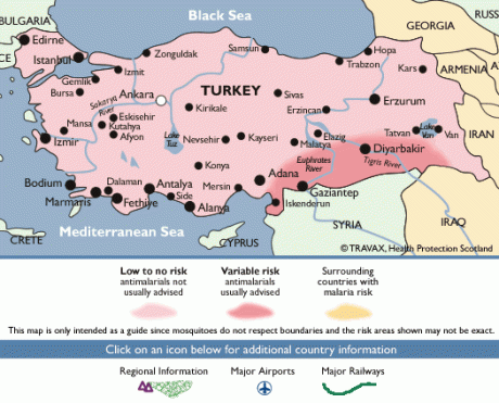
I was shocked because Turkey had to be the most developed country we would visit on that trip; how could they the only one where Malaria shots are necessary in certain parts. I felt even more shocked after I visited Istanbul, where its level of development seemed otherworldly compared to Damascus, Amman, Beirut, or even Jerusalem. They have a transit system that is efficient, people sort of obeyed traffic rules, and everything looked much better maintained. It felt like a European city, while the others felt like something else. I marveled at Istanbul’s unique mix of secularism  and development. Yet apparently for someone living in Diyarbakir, Malaria is a part of life.

What’s more startling is that Turkey’s HDI for 2010 is 0.679, behind Jordan and Tunisia and not far ahead of Algeria [source]. How could a city that seemed so modern be in a country less developed than resource-starved Jordan, who has some 13 miles of coastline and a mostly desertous landscape. Jordan’s GDP (PPP) per head in 2010 was $5,400 while Turkey’s is more than twice that at $12,300 [source]. There has been research from multiple good sources on the matter:

A great research publication called “Regional Disparities and Territorial Indicators in Turkey: Socio-Economic  Development Index (SEDI)” written by Metin ÖZASLAN, Bülent DINCER, and Hüseyin ÖZGÜR (found here) delves into this question with depth and authority I can’t match, so I’m going to just post some of their findings and briefly summarize them. They use 58 different indicators from myriad sources to measure provincial development and collate them into one index called the SEDI. Unfortunately this means that, like the HDI value from measureofamerica.org we cannot compare these values directly to other countries. Fortunately they do go into great detail in the article on their methodology and it appears to check out. Time for some cool maps thanks to this article.
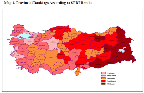
Many things stand out. Most of Turkey’s most developed regions are in the western part of Turkey, with the lowest SEDI scored provinces all being in the east.Four Cities+suburbs stand out as the most developed provinces in Turkey: Istanbul, Izmir, Ankara, and Bursa. These provinces (and a province that includes suburbs of from Istanbul) have a combined population of 26.14 million, according to Turkstat. This means that of Turkey’s 73 million people, just over a 3rd live in these five most developed provinces [source]. This shouldn’t seem so troubling, when you look at the US (as we did in the previous blog) you can see its not so uncommon for states (especially ones with big cities) to score higher on development indicators. The problem with Turkey is it’s development curve among provinces is much steeper than the disparity among US states. A graph from the same source illustrates this effectively:
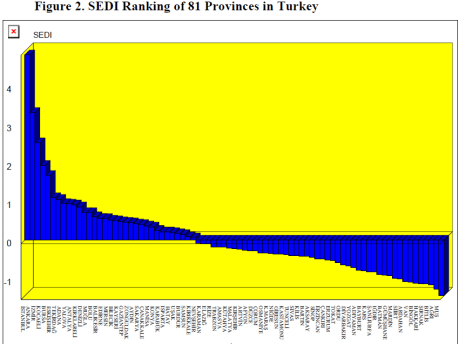
Istanbul’s score dwarfs the others, its more than four times that of 6th ranked Eskişehir province. The top five provinces themselves dwarf the remainder of the provinces.

Here is a map of the geographical regions of Turkey using the same source. I edited it to show which regions have above average and below average scores (note: mediterranean is almost perfectly at the average):
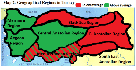
Now here is an unedited graph showing the regional SEDI scores from the same source:

This paints a picture of Turkey having three regions that this source claims, drive most economic growth in Turkey, with Marmara far outpacing the rest of the country. Meanwhile the two easternmost regions of Turkey experience the least amount of growth or development. This doesn’t perfectly coincide with the Malaria map I showed earlier, but I suspect that map was geared towards ease of use and probably wanted to include the entire southern border region to aid tourists traveling by land.

The next article I am going to use comes from the World Bank, titled “Turkey: Country Economic Memorandum Volume I – Main Report” it can be found here and the section I will cite begins on chapter 6, page 29 (41 in adobe). This article compares regional GDP per head variation among European countries and shows its findings in this graph:
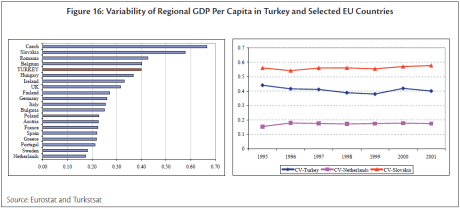
Turkey ties with Belgium, a country known for its Flemish/Wallonian divide (a north/south divide in this case). I am surprised by the other results in this publication, as I had assumed Italy’s regional GDP variation would exceed the UK’s.

This article points out that from 1980 to 2000 Turkey’s regional disparity has either increased (gotten worse) or stayed the same. It points out that while Industrial activity has expanded in the Western half of Turkey, the East remains primarily employed by agriculture, and that hours/employee are considerably lower in the East. Finally, the article gives some explanations for why Turkey’s institutions might inhibit growth in the Eastern regions; it states that Turkey’s centralized planning and allocation of resources for things like infrastructure and public works projects gives local officials few options to raise their provinces from poverty and underemployment.

A few quick statistics can be found in this report from the European Commission titled “Second report on economic and social cohesion: Regional Features in Turkey” found here. It states:

“between east and west: two-thirds of the population were concentrated in the west of the country in half the land area, accounting for 82% of national GDP, and with GDP per head 23% above the national average (41% of the EU average). In the east, GDP per head was 53% of the national average, much the same as 10 years earlier”

One word that is missing from all of these articles is “Kurd” which is surprising because Kurds make up the largest ethnic minority in Turkey with 15 million living there, most of them are located in the Eastern part of Turkey. Here is a map I found from the University of Texas here that shows where most Kurds live:,

I found another, more recent map here that looks at recent elections results in Turkey in 2011:


It’s worth noting that Turkey has a unique 10% electoral threshold that prevents most Kurdish interest parties from electing members into parliament; the easiest way to circumvent this rule is to run candidates as independents.

There seems to be a strong correlation (using these two maps and the first map) between Kurds and low development. I am not trying to imply that Kurds don’t work as hard, but simply pointing out that like Appalachia and the Mississippi Embayment, the Kurdish region of Turkey appears to lag behind the rest of Turkey. Something I would be very interested in seeing is how a partition of Turkey that removed part Eastern Turkey from the rest would effect the HDI value Turkey currently enjoys. Using the 3 sources from the beginning of this article, it seems clear that Turkey’s Western half would benefit (at least in its HDI score) if its indicators were measured separately from the Eastern/Kurdish part. Of course the political ramifications of such an outcome would be significant. I’ll leave that debate for the citizens of Turkey, be it Kurds or Turks.

recently I wrote about the trend of low HDI scores in the US South and Appalachia. This time I want to focus on a metric found from the same source. The metric of life expectancy from birth is actually a good way of comparing US congressional districts to other countries.

The CIA World Factbook has a listing of most nations’ average life expectancy from birth here. It’s important to note that because this is an actual year-based estimate, the rankings for congressional districts and countries is tightly ranked, and misreporting statistics from developing countries is a possibility. I want to stress that these are averages so while someone living 2 years less might not seem like much, but this is the result of everyone in a district/country living longer or shorter lives. Some of these statistics will make you question the world.

While I’ll mention the regional disparity briefly, I’d like to focus on the comparison of life expectancy with certain US congressional districts (CDs) and other countries as well.

Here is a map of the bottom 100 CDs in the US:

Many things stand out compared to the HDI graph representing the bottom 100, though the US South+Appalachia region is similarly represented in this map.

Firstly, the West Coast does considerably better than the East Coast, with only a single CD making the list west of Texas. Second, cities in many Eastern States have lower comparative life expectancies than their HDI suggests. Regions of the Rust Belt including North Ohio and the Detroit metro area score poorly. The mid-Atlantic cities Philadelphia and Baltimore do poorly, but the rest of the Northeast does well.

This map shows the bottom 25 districts in the US, these districts only live 72 to to 75 years on average (I’ll provide a complete table of average life expectancy later).

Much like the bottom 25 districts by HDI, the bottom 25 in life expectancy are almost all inside the US South and Appalachian regions. The Mississippi embayment and the Kentucky-West Virginia border are the worst hit.

Here is a listing of the bottom 100 districts by age. But I’ve added a column for countries with similar life expectancies for the bottom 50. I got these numbers here and here.

West Virgini 3 72.9 Egypt 72.66
Kentucky 5 73.6  Thailand 73.6
Mississippi 2 73.6 Bulgaria 73.59
Alabama 4 74.3 Serbia 74.32
Pennsylvania 2 74.4 Mauritius 74.48
Oklahoma 2 74.5 Algeria 74.5
Pennsylvania 1 74.5 Colombia 74.55
Georgia 2 74.6 China 74.68
Alabama 3 74.7 Syria 74.69
Alabama 7 74.7 Cook Islands 74.7
Louisiana 7 74.8 Hungary 74.79
Arkansas 1 74.8 Tunisia 75.01
Tennessee 8 75.0 Lebanon 75.01
Tennessee 9 75.0 West Bank 75.01
Mississippi 3 75.0  Macedonia 75.14
North Caroli 1 75.0 Tonga 75.16
Louisiana 5 75.0 ” “
Arkansas 4 75.1 ” “
Georgia 1 75.1 ” “
Missouri 8 75.1 ” “
Alabama 1 75.1 ” “
Georgia 8 75.1 ” “
Mississippi 4 75.2 ” “
South Caroli 6 75.3 Lithuania 75.34
Florida 4 75.3 ” “
Louisiana 4 75.3 ” “
Mississippi 1 75.4 Antigua and Barbuda 75.48
Georgia 12 75.4 ” “
Arkansas 2 75.4 ” “
Michigan 13 75.4 ” “
Michigan 14 75.4 ” “
Kentucky 1 75.5 ” “
Maryland 7 75.5 ” “
Louisiana 6 75.5 ” “
District of Columbia 75.6 ” “
Louisiana 1 75.6 ” “
Oklahoma 4 75.6 ” “
South Caroli 5 75.7  Ecuador 75.73
Louisiana 3 75.7 Croatia 75.79
Alabama 2 75.7
Alabama 6 75.7
Tennessee 1 75.7
Virginia 9 75.7
West Virgini 2 75.9  Morocco 75.9
Louisiana 2 75.9
Tennessee 4 75.9
Oklahoma 5 76.0  Poland 76.05
North Caroli 7 76.0
Oklahoma 3 76.0
Oklahoma 1 76.0
Virginia 3 76.0
Alabama 5 76.1
Texas 1 76.1
Ohio 6 76.2
Kentucky 4 76.3
Illinois 12 76.3
South Caroli 3 76.3
Texas 13 76.4
Tennessee 7 76.4
Virginia 4 76.5
Georgia 3 76.5 Mexico 76.47
Texas 8 76.5
Michigan 5 76.6
Tennessee 6 76.6
Kentucky 3 76.6
Tennessee 3 76.6
Indiana 7 76.6
Texas 5 76.6
Michigan 11 76.7
North Caroli 10 76.7
Missouri 5 76.7
West Virgini 1 76.7
North Caroli 3 76.7
South Caroli 4 76.7
Texas 19 76.8
North Caroli 8 76.8
Texas 2 76.8
Georgia 11 76.9
Ohio 15 76.9
North Caroli 2 76.9
Maryland 3 76.9
Indiana 1 76.9
California 2 76.9
Georgia 10 76.9
Maryland 2 77.0
Ohio 17 77.0
Ohio 9 77.0
Missouri 4 77.1
North Caroli 5 77.1
Virginia 5 77.1
Kansas 4 77.1
Indiana 8 77.1
Wisconsin 4 77.2
Missouri 3 77.2
Tennessee 2 77.2
Ohio 10 77.2
Ohio 11 77.2
Tennessee 5 77.2
Indiana 6 77.2
Texas 14 77.2

Surprisingly, many countries perform better than US congressional districts. Eastern Kentucky has the same life expectancy of someone in Thailand, think about that for a second. Not only are parts of the US much lower than the US average, they’re actually much lower than most developed countries. The US  ranks 50th overall on the CIA World Factbook, th0ugh a number of meaningless micro-states and dependent territories distort this ranking somewhat. US life expectancy raises many important questions about access to healthcare and our dietary habits among other things.

Finally, I want to point out that some of these statistics are hard to accept. Jordan ranks higher than the Netherlands, for example. and Bosnia, despite its violent recent history has a higher life expectancy than Denmark. I’m not necessarily accusing these countries of outright dishonesty, but perhaps their methodology was vulnerable to inaccuracies. There are hundreds of thousands of Bedouin in Jordan, many of them weren’t born in hospitals so its possible that age estimates could be wrong. This isn’t the first time I’ve suspected this, in a much earlier blog on female literacy I found that the country of Georgia claims 100% literacy, despite having a GDP per capita lower than Syria, and a very rare and complicated language, in addition to smaller languages like Tsez being spoken. Take these statistics for what you will, its intriguing no less.