Archives for posts with tag: USA

If you know anything about me, you probably know that I watch the polls for national elections like a watch college football: obsessively. While polling is an imperfect science, it offers the best glimpse into an electoral result before people vote. Politicians dedicate massive resources to poll constituents, either by conducting polls in house or by contracting polling organizations. Polls often determine how and what a candidate will speak about in public addresses, or what promises might be made on the campaign trail. It should come as no surprise that Governor Mitt Romney has distanced the healthcare reform he implemented in Massachusetts from Obama’s healthcare reforms; after all, polls show a majority of Americans oppose Obama’s healthcare legislation.

While politicians usually keep their in house polling private, there is a wealth of polling data that is public and well organized. RealClearPolitics collects polling data from a wide variety of sources and nicely organizes them into polling averages for a particular race. Using multiple polls adds legitimacy and a degree of predictability to polls.

In this post I’d like to focus on the polling on the US Presidential election and the implications on the electoral geography in 2012. When I say electoral geography I am referring to the relative significance of certain US regions in presidential elections. The US uses the Electoral College system, which isn’t really as complicated or unfair as its maligned for being. Every state is given a number of Electoral College (EC) votes based on their total congressional delegation: the total number of Senators and Representatives. Every US State gets two Senators regardless of size, while Representatives are allotted based on population. Because most states (Nebraska and Maine allot some EC votes by congressional district) are winner-take-all, certain larger states are immensely important. In 2008, Obama turned many states that were considered “safe” Republican holds blue:

Most notably Obama turned Indiana, Virginia, North Carolina, and one congressional district in Nebraska blue. Obama’s victory was so sweeping that he could have lost California and New York and still won the Electoral College; but much has changed since 2008. It is looking increasingly unlikely that Obama can win many of these states that he turned blue four years ago, and persistent high unemployment has made Obama vulnerable in a number of states. All of this makes for an election with many more “swing states” than previous elections have had:

Polling comparing Obama to the Republican field for 2012 has been both extensive and varied in results. Most polls show that right now Obama would easily defeat any of the GOP contenders by both popular vote and Electoral College, with the exception of Mitt Romney. Because Romney is leading the Republican Primary right now and polls the closest to Obama, I will use polls comparing Romney to Obama as a basis for my electoral maps. With the exception of Missouri, every state I listed as a swing state on the map above was won by Obama in 2008. Instead of laboring over the polling in every state I will justify my decisions briefly here: Michigan, Minnesota, and Wisconsin aren’t “swing states”  because recent polls have Obama winning each state by at least 8% (the same margin that polls show Romney winning in Georgia).

So with 146 EC votes apparently up for grabs, one might ask why I titled this post “Why Ohio Means Everything,” surely 18 measly EC votes isn’t going to dictate who wins, right? Ohio’s significance as a key swing states derives from a historic fact: no Republican has ever won a presidential election without winning Ohio. One can counter that history does not determine the future; after all, no Democrat had won Virginia since 1964 before Obama broke that trend in 2008. But Ohio’s historic significance is less important here than its contemporary trends. Ohio and Pennsylvania share the distinction of being large swing states, but Pennsylvania’s demographics give it a slightly Democratic lean in national elections. For reference, the Cook Partisan Voting Index (PVI) shows Pennsylvania as D+2 and Ohio at R+1 (for perspective they rank Alabama at R+13 and Massachusetts at D+12). Part of this derives from the voting tendencies of the large metropolitan areas on both states. In 2004, Ohio’s Cleveland and Columbus metro areas supported John Kerry, while Cincinnati sided with George Bush. Pennsylvania’s large Philadelphia and Pittsburgh metro areas strongly supporting Kerry back then.  Bush ended up winning Ohio by 2% and losing Pennsylvania by 3% that year. Four years later both states would turn blue, with Obama winning Ohio by 4% and Pennsylvania by 10%. This trend is older than recent history: Ohio has not voted Democratic without Pennsylvania also doing so since 1948!

Interestingly, new polls actually show Obama doing better in Ohio than in Pennsylvania (it should be noted that polls in Penn. are a month older). Both RCP averages have Obama winning by 4.5% and 3.2% respectively (see previous links). Some have suggested that a recent referendum on collective-bargaining rights for public sector employees may have pushed Romney’s support down in Ohio. Were these polls to translate into wins for Obama, Romney’s chances to win the election in 2012 look much different:

For Romney to win, he would need to net 100 EC votes out of 108; Obama, on the other hand, could win by taking just ten. This makes the polls in the remaining swing states critical to Romney’s changes; here is a list of RCP averages in the remaining states:

Colorado (8/4 – 12/4): Obama +4.5%*

Florida (1/19 – 1/27): Romney +0.3%

Iowa (7/5 – 11/29): Obama +2.6%

Missouri (11/9 – 1/29): Romney +1.5%

Nevada (10/20 – 12/20): Obama +3%

New Hampshire (11/28 – 2/2): Obama +3.5%

New Mexico (6/23 – 12/12): Obama +11%*

North Carolina (12/1 – 1/11): Romney +2.6%

Virginia (12/11 – 1/18): Obama +1.7%

(note: *only one polling organization used, I was unable to find polls for Indiana.)

Even if Indiana went to Romney, his chances of winning 100 EC votes from these states is low. The problem doesn’t just come from larger swing states like Florida and Missouri, but from smaller ones as well. If Ohio goes blue, states as small as New Hampshire and Nevada could tip the EC advantage in Obama’s favor. Expect campaigning in the buckeye state to be brutal. Some speculate that the recent jobs report will alter the dynamics of the presidential race, in what ways remains to be seen. I, for one, plan on watching these polls obsessively over the next year; so much can happen between now and November!

After months of mental stagnation I’ve decided to return to the world of blogging with an extra spergy post on the economic policies being considered on both sides of the Atlantic. Before I expand on this subject I want to send a special thanks to economist bloggers Paul Krugman, Brad DeLong, and Matthew Yglesias for inspiring me. I absolutely don’t belong in the same category as them but I feel so much better informed by their blogs. For anyone looking to learn a little bit more about economics or economic theory I highly recommend following these blogs. For additional perspectives from economists you should also consider the blogs referenced in this compelling economist article.

The topic for this post will be the economic policies that are currently being considered in both the European Union and the United States. Before I go further I want to define two terms that I will be using a lot in this post:

Austerity: “In economics, austerity is a policy of deficit-cutting, lower spending, and a reduction in the amount of benefits and public services provided.[1] Austerity policies are often used by governments to reduce their deficit spending[2] while sometimes coupled with increases in taxes to pay back creditors to reduce debt.[3]” (from wikipedia)

Expansionism: “some have linked the term to promoting economic growth (in contrast to no growth / sustainable policies).” (also from wikipedia)

While some time has passed since the debt ceiling standoff and subsequent downgrade by Standard and Poor rocked US markets, the debate remains central to US economic policy. In recent Republican debates austerity has been almost universally endorsed. Governor Rick Perry went  so far as to propose eliminating three government agencies, though which three is still up for debate. This stance on austerity has also been endorsed by Republicans in Congress, with multiple proposals to reduce government spending in the short and medium term.

Across the Atlantic, similar proposals have not only been proposed but have been implemented in several countries that were affected by the Eurozone debt crisis. Germany’s Angela Merkel has been one of the most ardent proponents in the Eurozone for an austerity-centered response to debt crisis. The economist states:

Italy and Greece, under new technocratic governments, may now be more serious about living within their means and reforming their faults. France, which has run budget deficits since 1974, is adopting austerity. Spain has introduced a constitutional debt brake.”

In both Europe and the United States austerity has been proposed as a solution to the risk of bond market action on sovereign bonds. I think it is critical to understand a few key elements of what this “bond market action” implies here. When governments seek to borrow money, they auction sovereign bonds denominated in the currency used by those respective governments. Governments then have to pay back those bonds with interest. This interest is called the “yield” and has an inverse relationship to demand for those bonds. So if a bond is in high demand, the yield will be low, while a bond with low demand will have a higher yield.

Ratings agencies, which represent the interests of bond-buyers will give ratings on sovereign bonds based on how likely they think they will be repaid. Even though a nation’s sovereign debt rating can be related to its yield, the two don’t always correlate to one another.  When the United States lost its AAA rating from Standard and Poor (the other two major ratings agencies kept the AAA for the US) stock markets lost record volume but demand for US sovereign debt actually went up. As I write this the yield on US 10-year bonds stands at 1.89%, while it stood at 3.01% on July 20th, 2011.

While 2% is considered serviceable, higher yields can cripple a country by forcing it stop borrowing altogether. Greek 10-year bonds have yields more than ten times higher than their US or German equivalent:

At present, Greece would have to pay 34% interest on a ten year loan. This has effectively locked Greece out of selling its debt. It would seem natural then, that the countries that are now bailing out Greece would insist that Greece cut government spending sharply and try to raise more taxes to cut its deficit. After all, if Greece were able to finance its spending without having to borrow money, yields wouldn’t matter, at least in the immediate term. Germany, the biggest Eurozone economy, has led the push for austerity in Greece and other Euro countries with dangerously high yields (Italy, Spain, Portugal, Ireland have all faced high yields).

There is a danger to this logic though, that comes with the effects of austerity. In return for the first bailout, Greece agreed to sharply reduce public spending, including cuts in pensions and wages for public sector workers, yet it still fails to meet deficit targets set by the EU. Germany is now proposing that the EU take direct control over Greece’s government spending, something deeply unpopular in Greece (source). The problem that comes from this arrangement is that austerity has not let to growth in Greece’s economy. In fact, since the first bailout in April 2010, Greece has seen its economy contract sharply:

This is as troubling as this looks, it easily could have been predicted. When you lower spending like Greece has done, you are in effect giving public sector workers/pensioners less money to spend, lowering demand. This weakens economic output across all sectors of the economy, as private businesses adjust to lowered demand by laying off workers and producing less. This does more than just damage the livelihoods of Greek citizens, it actually exacerbates the government’s finances. As Greece’s tax base becomes less wealthy, the government must either raise taxes further (which certainly does not stimulate growth) or continue to run a budgetary deficit just to maintain the status quo.

Greece is not alone in its struggle to grow as the effects of austerity bite, other Euro countries that have recently implemented austerity have seen growth slow:

This graph measures annual GDP growth in the Q3 2011, and with the exception of Slovenia, all of the worst performers had to implement some form of austerity in response to high yields/EU intervention.

It is not just the opinion of amateur bloggers (like me) or angry protesters in Greece that austerity alone cannot ensure debt repayment. Standard and Poor recently downgraded 9 Eurozone countries, and in its FAQ explaining the downgrades stated:

… As such, we believe that a reform process based on a pillar of fiscal austerity alone risks becoming self-defeating, as domestic demand falls in line with consumers’ rising concerns about job security and disposable incomes, eroding national tax revenues.”

The German response to the downgrade borders on intransigence:

German chancellor Angela Merkel has called on eurozone governments speedily to implement tough new fiscal rules after Standard & Poor’s downgraded the credit ratings of France and Austria and seven other second-tier sovereigns.”

This is especially swaying because ratings agencies like S&P have no vested interest in placating debtor states, but instead act on behalf of creditors. Fears over German stubbornness over austerity has led to a recent outpouring of criticism from the world’s economic leaders. IMF head Christine Lagarde, US Treasury Secretary Tim Geithner, and Financier George Soros all warned of dangers of austerity at the recent World Economic Forum at Davos. At a separate summit, Nobel prize-winning economist Joseph Stiglitz warned that Germany was pushing Europe towards a suicide pact, saying:

It is like blood-letting, where you took blood out of a patient because the theory was that there were bad humours. and very often, when you took the blood out, the patient got sicker. The response then was more blood-letting until the patient very nearly died. What is happening in Europe is a mutual suicide pact

It’s worth noting that Stiglitz had similarly critical things to say about US austerity, pointing out that the US has shed 700,000 public sector jobs over four years. While European austerity has been rightly criticized for its futility, it must be pointed out that Eurozone countries have faced something that the US has not, high yields. One of the most baffling aspects of the aspects of the recent push for austerity across the Atlantic is that, while the US has lost its AAA rating by S&P, its yields have stayed historically low. While it makes little sense for Greece to endure agonizing economic contraction from austerity, it makes considerably less sense for the United States to follow that path. While borrowing costs for the US government are historically low, unemployment remains stubbornly high.

It should be both shocking and perplexing that in spite of this Republicans in Congress have held up virtually every piece of expansionary legislation recently proposed. Republicans have been so opposed to promoting growth through legislation that they nearly blocked a tax cut designed to boost growth from being renewed until they came under intense political pressure and relented.

On both sides of the Atlantic there has been a drive for austerity that has hitherto done little to calm the markets OR promote growth. And while countries with high yields have faced inevitable pressure to reduce deficits, the real tragedy stems from the lack of leadership from countries with the room for maneuver to lead and coordinate expansionary policies. The political systems in Germany and the United States have both been alarmingly inflexible and wrong-footed in their respective approaches to promoting economic growth and stemming the threat of double dip recession.

Yes you read that correctly, this blog is not about East Asian geopolitics or the debt-to-GDP ratio of OECD members, this blog is about Pop Culture. I’ve been overwhelmed by the deluge of bad/terrible news relating to the economy and the state of world affairs lately. I don’t really want to know whats going in US/world politics right now. So instead I’ve decided to write a blog about something that mildly irritated me during the last Academy Awards winner. I have no qualms with The King’s Speech getting the award but I felt like it winning betrayed the  betrayed mainstream and critical acclaim The Social Network had received.

I felt like there was a generational gap in the two film’s importance. For me, and younger people I think Facebook’s cultural importance is ubiquitous. When the film came out its tagline was “You can’t make 500 million friends without making a few enemies” it seemed cool, and underscored the enormous importance of Facebook. The film reminded me of Pirates of Silicon Valley, or other films that helped to characterize the rise of companies that represented a sea change in society not just a new product that consumers bought. But this blog isn’t about my weird opinions about movies, it’s actually about the award itself.

The Academy Awards are one of the few non-sports TV events that I watch consistently. I’ve always liked that in order to win an Oscar, a film is not judged on its sales or its popularity, but by its merit. Recently I finally bothered to look into the rules for selection and voting in the Academy Awards. According to Wikipedia there were 6000 Academy Awards voters in 2007. For most award categories voters vote for awards that relate to their categories (actors vote for actors etc.), But a critical exception is voting for Best Picture, where all voters are eligible. While have no problems with the film industry being involved, but I think the vote would be fairer if film critics were given a share of the vote as well. I feel this way in part because my other TV-watching addiction comes from College Football, where human polls play a more important role than in any other sport. For years people have criticized the human elements of College Football in polls for being biased, and sometimes error-prone. Often there are ballots from the Coaches Poll where one or two teams in the  top 5 aren’t on their ballot at all, and coaches almost always rank their teams higher than average.

I can imagine voters for the Oscars are similarly prone to personal bias, though the large number of voters probably mitigates this risk. If it weren’t for two websites, I probably wouldn’t question the Oscars outcomes at all, most of the time I don’t see all of the nominated films anyway. But thanks to Metacritic and Rotten Tomatoes there are now more refined ways of determining how well received a film is with critics.

Rotten Tomatoes has been in existence for some time (I can recall reading it in high school) and its method has stayed simple and consistent for some time: select from a list of critics (a much wider list than metacritic) and determine whether each review is positive or negative, then give a percentage of all reviews that are positive. So, for example, if you wanted to know how many people thought The Sweetest Thing was utterly without merit (it is) you just on RT and, lo and behold, only 26% of critics wrote a positive review for the film. This was based on 107 reviews from sources ranging  from Richard Roeper of Ebert & Roeper to Christine Blosdale of BeatBoxBetty.com, a website that looks trapped in the 90s. Having a broad pool of reviews isn’t necessarily a bad thing, it helps to limit the impact of one bitter film critic rating a film “0” and devaluing an otherwise popular film.

On the other hand, metacritic uses a very selective list of critics who mostly write for large publications (The Rolling Stone, The New York Times) and they average their scores for films using a 0-100 metric. Perhaps in response to this, Rotten Tomatoes now offers a “top critics” tab that narrows ratings to ~45 of the best reviewers. But this doesn’t change a fundamental difference between the two websites: one answers “how good do most critics think this film was” the other answers “how many critics thought that this film was good?”. I think both have their merits but metacritic’s strategy is more useful for determining which movies ought to win awards.

I’ve created bar graphs that compare films selected for the past four Oscars in the “best picture” category and I’ve ranked them by their metacritic score (underlining the film that actually won). I also listed Rotten Tomatoes’ percentages using the “top critics” option from the site:

Starting with 2007:

I think this year best summarizes the differences between the two methods: I liked Juno, I bet most filmgoers liked Juno, but that doesn’t mean that most people thought it was exceptionally good. I liked There Will Be Blood too but I think it represented a deeper meaning, a heavier and more complicated reality than Juno did, and simply asking critics if they liked a movie will never show this distinction. I wouldn’t draw too much from No Country for Old Men losing out as the difference was likely down to how much coffee Ebert drank when he wrote the review.

2008 shows more variation:

An interesting advantage of using metacritic scores over Oscar winner outcomes is that you can actually compare how good a year in film did compared to years on average. 2008 looks like a weaker year using metacritc. I agree that Slumdog Millionaire was the best film of 2008, but I don’t think it would have won in a different year. It’s also interesting to see how poorly The Curious Case of Benjamin Button and The Reader fare, perhaps I should note that The Dark Knight scored higher than the bottom 3 nominees with 82 on metacritic  : – )

2009 introduced a 10 nominee process:

The suspense of the Oscars race between The Hurt Locker and Avatar does not bare out when using metacritic, as the gap is wide. Avatar’s high chances at the Oscars could have been related to its reputation as a rev0lutionary step in film production and special effects in particular. Needless to say, critics were less impressed by this.

And now my favorite year, 2010:

I think 2010 was the best year in film in the past decade by far. Individual films from other years might compete on merit but 2010 had so many good films. I personally loved 127 Hours, Inception, and The Social Network for their own particular directions and thought/read mostly positive things about The King’s Speech, Toy Story 3, The Fighter and The Kids Are All Right. I didn’t watch/read about True Grit or Winter’s Bone. The only film I actually disliked was Black Swan, which I found to be too formulaic and predictable.

Finally, which of these films was the best overall? My final graph:

This is how metacritic views the nominees for “best picture” over the past four years. What do you think?


From the BBC: China has reacted angrily to a US deal to upgrade Taiwan’s ageing fleet of US-built F-16 fighter planes.

This recent development where the US has agreed to a $5.85 billion renovation plan has renewed a long standing dispute between both (The People’s Republic of) China and Taiwan (Republic of China) and China and the United States. Comprehensively explaining the conflict would be both time consuming and needless, there are a variety of great sources on the matter.

Here is a quick summary, between 1945 and 1950 China had a civil war between the Communist Party led by Mao Zedong and the sitting government ruled by the KMT. Eventually the Communist Party captured the entire mainland of China and the KMT was forced to retreat to the Island of Taiwan, no armistice was signed. The US is involved in the hostilities because it supported the KMT both the during the conflict and afterwards by refusing to recognize the Communist controlled mainland as the legitimate government of China for some time. For several decades the ROC (Taiwan) refused to lift its claim over all of mainland China, with many additional countries contained in their claim (see below):

Incidentally, the People’s Republic of China also claims the entire territory of Taiwan, calling it the “Taiwan Province, People’s Republic of China.” As time has progressed, relations between the two entities has been fraught with conflict and frequent military and diplomatic posturing. Currently only a handful of countries fully recognize Taiwan as an independent state, most of them are small states. Despite America’s lack of official recognition of Taiwan it continues to support Taiwan both militarily and politically under the Taiwan Relations Act. Thus the F-16 package recently signed between Taiwan and the US isn’t anything new.

What is new, however, is the regional balance of power and its impact of relations across the Taiwan Strait. While relations have been better in recent history, there have been notable flareups in the past 20 years. These flareups (along with cross-strait relations at large) have been keenly observed by diplomats and academics alike. They watch with particular attention because cross-strait relations are often viewed as a bellwether of China’s military and economic rise and its relationship with the US, who China is now beginning to rival in economic output (using PPP, more on this later). Relative changes in the balance of power between both China and Taiwan and China and the US should be seen as a background for conflicts across the strait of Taiwan.

If one were to use only the Realist or Neo-Realist schools of thought on these relations, one might puzzled by the continued support the US gives to Taiwan. After all, Taiwan is a small country of just 23 million people, which trades less with the US compared to China. But this would be viewing things from an ahistorical perspective. Taiwan’s democracy and historic political ties with the US were once backed by a level of military spending that was closer to China’s than it is now. Without disregarding the current tension over this recent US F-16 deal, I would like to present graphs of relative power that play as a backdrop for the cross-strait relations over the past 20 years, focusing on events in 1995-6 and 2008.

Below is a graph I made using data from SIPRI on military spending from the US, Taiwan and China. (The excel spreadsheet is free if you fill out a small form here):

As one can see, in 1990 despite China seeing substantial growth in the 80s and having a population over a billion, it spent only 46% more on its military than Taiwan. China also had (and continues to have) a large border with numerous flashpoints (Arunachal Pradesh with India, among others) that could have complicated any military deployments near the Taiwan Strait. In 1995 this figure changed only slightly, with Taiwan still spending nearly 50% of what Mainland China spent on its military. This complicates a Realist/Neo-Realist interpretation of the 1995-6 Taiwan Strait Crisis.

During this crisis the then president of Taiwan Lee Teng-hui began moving away from a One China policy towards an Independent Taiwan stance. This angered PRC officials and made his 1995 visit to his alma mater, Cornell, a diplomatic crisis both between China and Taiwan and between China and the United States. In 1995 and 1996 China conducted a series of missile tests and eventually an amphibious assault exercise in the Strait, acts frequently viewed as a tool to intimidate voters in Taiwan from voting for Lee Teng-hui. The US responded with what was dubbed “the biggest display of US military power in Asia since the Vietnam War” sending two battle carrier groups into the region. Lee Teng-hui won the election that year, and tensions remained high for some time afterwards. But if China was willing to threaten Taiwan, perhaps it no longer feared Taiwan’s military. Perhaps instead, China wanted to test the alliance between Taiwan and the US.

Comparing US military Spending to China’s paints an asymmetrical picture:

In 1995 the US military spent almost 20x as much as China on its military! But the reason people are eying the Taiwan Strait as a bellwether has as much to do with the economic rise of China as its military rise. After all, a country can only spend as much on its military as its citizens are willing to sacrifice in money for whatever potential benefits that military might bring. While China’s military spending is still a fraction of US spending, its exponential increase underscores the fast-changing pace Asian political geography.

The graphs below show the GDP (national income) of the three nations using exchange rates only, and does not factor in prices in domestic markets. If you wanted to compare how much bread people could buy this would not be a good source because bread might be cheaper in other countries. But if you’re looking at international trade (or purchasing arms) this is actually a better source than Purchasing Power Parity since exchange rates would come into play.

As you can see, China’s rise has transformed its comparative wealth with both the United States and with Taiwan. It also helps explain how China’s economic growth was partially matched by Taiwan in the early 90s. In 1995 Taiwan’s GDP represented ~38% of mainland China. Now it represents just 7.3% using exchange rates.

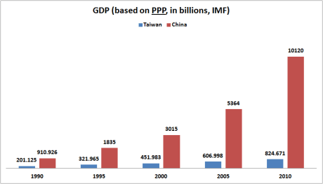
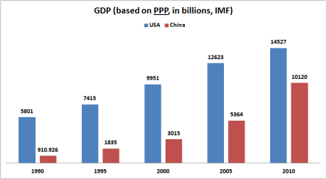
Now lets look at a final set of graphs showing GDP using Purchasing Power Parity. This should shore up the differences in cost between both Taiwan and China versus the USA.

The first difference you notice is that both China and Taiwan’s GDP double here. This is because China and Taiwan both partake in a form of currency manipulation. Essentially, by undervaluing their currencies, these countries give their citizens less buying power on the international market, promoting domestic consumption instead. Having an undervalued currency enables these countries to export at a lower cost as well.

This data comes from the IMF, which also forecasts future GDP. They predict that by 2016 China’s GDP will surpass the United States; by then Taiwan’s GDP would represent only 6.3% of mainland China’s GDP. This is all important because it might help to explain the recent detente between Taiwan and China, beginning in 2008. This has included high level talks between the leadership of both countries as well as economic integration, and most notably frequent cross-strait commercial flights.

I have a feeling that this recent policy change comes from a re-evaluation of Taiwan’s security dilemma from within. The term “security dilemma” is used by Realist and Neo-Realist theorists in International Relations to describe a state’s conflicting needs. A state must enough power to repel aggressor states but if that state becomes too powerful it will provoke other states to counter that strength either through alliances or by increasing their own security. A common measure of power/security in Realist theory is money (GDP) or other resources. Using this level of analysis, one would surmise that China’s rise in GDP was always a threat to Taiwan and other nearby states, but that Taiwan’s countering check on Chinese growth depended on US security assurances, as the US was stronger than China. Taiwan might now be betting on the US continuing to being a powerful ally, but wants to prolong the status quo until it can find new ways to counter China’s rise. There are, of course, other interpretations of recent developments. Expect to see more headlines regarding Cross-Strait relations, as the IR community watches with great anticipation.

(note: I haven’t written a blog in weeks because I’ve moved recently and have been working a great deal since then.)

One thing that is too often absent in the debate about immigration in developed countries has been the so-called “Brain Drain.” This term is used to describe the trend of mass emigration of skilled/highly educated workers (also called “human capital”) to a few high interest places. This trend has been documented both between countries and inside of countries. In the US, this has been described as “rural flight” while the international phenomenon continues to be called either “human capital flight” or simply the “brain drain.” Most developing countries see some form human capital flight, be it Ethiopia’s loss of doctors to Chicago or the high percentage of Chinese who study abroad and choose to stay abroad after graduating. While these countries lose human capital, many developed countries gain human capital as a result of this.

America and other developed countries benefit immensely from large amounts of highly educated individuals migrating to their shores:

(source)

The trend isn’t new, either. From the Chinese source we can see that even in the 1970s Chinese students were moving to the US with only a minority choosing to return. Similarly, the trend of educated individuals fleeing the countryside in America isn’t new; this map shows US migration from 1970 to 2000:

Something that’s always interested me when it comes to maps/graphs about the brain drain is they often break down either by country (which country is gaining and which is losing) or they only focus on recent statistics (who is moving where right now). Instead I would like to look at which parts of the US have the highest concentration of educated/skilled individuals. This is not intended to rank how intelligent parts of America are, or to malign the parts of the US where educational attainment is low. Instead I want to look at where the highest concentration of people with at least post-secondary education reside in the US. I decided to use the American Human Development Project in part because it allows you to measure these indicators by state but also by Congressional District (CDs). I think this is the best metric because US congressional districts have to be at least similar in population, only small states like South Dakota have wildly divergent congressional district populations. Of course there are other problems that can threaten congressional districts as units of measure: they can be gerrymandered to include disproportionate percentages of groups for political reasons. But while this could threaten the reliability of statistics on educational attainment, I don’t think it threatens the reliability of broader observations about educational attainment in the US.

Alright, now for my map and my methodology: I used a ranking of the top congressional districts in the US by percent of population with at least a Bachelor’s Degree. I made the threshold 32%, which produced 121 congressional districts. (You can find a table of this data here)

Many things can be noted from this so I will just list them first. The the states with the most CDs with at least 32% populations with a BA are: California with 18, New York with 13, and then Massachusetts with 8, several states then tie with 7. States not on the list include: Alaska, Arkansas, Delaware, Hawaii, Idaho, Iowa, Kentucky, Louisiana, Maine, Mississippi, Montana, N. Dakota, Nevada, New Mexico, Oklahoma, Rhode Island, S. Carolina, S. Dakota, West Virginia, and Wyoming.

What I found interesting was the heavy concentration in particular areas. Despite its smaller population, the Bay Area in California has nearly as many CDs (8) as the rest of the state (10). Massachusetts is similar in this regard: only two CDs in the state aren’t counted, the entire Boston Metropolitan Area is included. Massachusetts actually has more CDs on this list than Texas (with 3.8x as many people). Boston’s high concentration of respected universities is likely a factor in this, take a glance at this map I found on Radical Cartography of Boston:

Similarly, California’s Bay Area includes Standford University and UC Berkeley, which probably contributes to its high percentage of college graduates. But does my list adequately grasp which parts of the US have the highest concentration of skilled/educated workers? I decided that pruning this list down by making the criteria higher: what congressional districts have a 45% or higher population with at least a Bachelor’s Degree? lets see what we found (my updated list can be found here):

This pruning yields some interesting results. While many metropolitan areas were represented on the former map, this updated map excludes many large cities. only 4 CDs from southern states are listed, which makes them notable. The Research Triangle in North Carolina (a region where UNC, NC State, and Duke intersect) is represented, 2 CDs from the Atlanta metro area and one from Houston are included. The Boston-Washington DC corridor is well represented with 16 CDs, while California has 7. What’s notable about California is that when you raise the threshold to 45% it actually puts the Bay Area on top with 4 CDs, compared to the rest of the state’s 3.

Finally, I wanted to corroborate these findings with a final metric. We know now where the highest concentration of people with at least 4-year degrees are, but where do people who go beyond that tend to live? I took the 30 congressional districts with at least 18% or higher having a Master’s or Professional Degree (think medicine/law/engineering degrees). Here we find similar results with the previous graph:

Here we see that like in the other graph, the Boston-Washington corridor and California are leading the nation with 16 CDs and 7 CDs respectively. In addition to these dominant regions, Seattle, Houston, Chicago, Atlanta, and the NC Research Triangle appear to have to highest concentration of human capital.

Finding out where the largest concentration of human capital is a much easier question to answer than why that concentration exists in the first place. Here are some of my less informed ideas about these maps and why we find concentrations of human capital in a few places. One immediate assumption I had was that these elite regions must have the highest wages in the country and thus attract the most human capital as a result. But surprisingly, the top 30 districts didn’t directly correlate with higher wages. Comparing Income Index with % Master’s/professional degrees produced almost as many mismatches as it did hits. None of the Boston metro districts made it to the top 30 in Income Index and Seattle and 8 others were also not in the top 30 Income Index districts. I am by no means asserting that wages and education don’t correlate here, just that they don’t perfectly correlate this instance.

But some broad observations do appear to hold true: places with more than one elite university in near proximity tend to have more human capital (UC Berkeley+Stanford in the Bay Area, Boston’s plethora of top schools, The Research Triangle’s UNC+Duke, etc.). There also appears to be a based on type of industry for at least a few districts. Microsoft and Amazon.com are headquartered near Seattle and Boeing was headquartered there and still operates a large plant in the region. The importance of Silicon Valley cannot be understated: Facebook, Apple, Google, and Intel are all based there. Washington DC’s role as the epicenter of national political life and most federal agencies makes the region’s concentration of human capital almost inevitable (Imagine the human capital the CIA, FBI, NSA, DoD, DoS attract?). Finally, places of commerce like Houston and Chicago probably attract a great deal of human capital with a combination of incentives.

I think the question of critical importance for regions that lack these advantages in attracting human capital (be it a lack of quality universities or lucrative industries) is to attract human capital using alternative methods. According to one source, making housing attainable in the urban core where they say amenities/diversity/jobs/social life are usually concentrated. A compelling blog was written about attracting smart people to cities that rates cities by their potential and actual college graduates by sq/mile. Personally, I just hope that my city doesn’t get left behind in the zero-sum competition over human capital.

I hate writing an ideological blog post for many reasons. Foremost I believe that research and information is easily dismissed when it is attached to an ideology. Secondly, I think it’s possible to learn a great deal about the world without resorting to an ideological framework, so why not avoid it? This blog forgoes some of this belief in the hopes of raising some clarity on one of the biggest issues in US politics right now: US public debt.

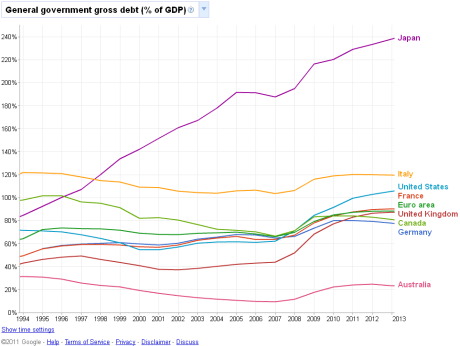
Partially born from the Tea Party movement, but also from earlier advocates of debt reduction, there is now wide concern over the dangers of our public debt. There’s even this website that shows US debt figures by the second and subsequently crashes your browser. There is legitimate cause for concern, as the Eurozone has witnessed astonishing upheaval over some of its members’ sovereign debt. The US borrows a lot of money, with its current gross debt at around $14 trillion. But while groups have painted the US debt as a leviathan that presents an existential threat, I feel this is hyperbole.  Yes, the US borrows a staggering amount of debt to finance its government, but it also produces an enormous amount of money. The US has a GDP of about $14.6 trillion; it’s easily the largest economy in either Purchasing  Power Parity or Nominal enumerations, making its debt more serviceable than Greece’s because it owes a smaller amount of money than it produces annually. When comparing gross public debt to GDP instead of gross debt in absolute terms, the US debt looks considerably less out of control:

This graph was taken from Google Public Data Explorer, and can be accessed here. The data comes from the IMF, and shows US debt ballooning in recent years, though its still considerably lower than Greece’s debt or Japan in particular. This doesn’t mean the US would be fine was its debt to reach Japanese levels. But it begs the question: why are we so concerned about government spending if we could simply outgrow our debt?

Critics of the debt policy we currently have argue that the government has become massive and spends enormous amounts of money inefficiently. We do spend trillions of dollars on our government, but again we produce trillions more in income every year.

Again this graph is from Google Public Data Explorer and can be found here. I used data from 2001 onwards because the US didn’t have figures for government spending before then. We see from this graph that our government actually spends some of the least compared with other developed countries. Only Australia spends less as a percentage of GDP compared to the US. France spends over 54% of its GDP on government compared with the US’s 41%. The US falls well below the Eurozone average of 49%. So in perspective, our government isn’t a leviathan unless you only look at spending in absolute terms.

Why did we get here? It has been argued that Obama ushered in a new era of government spending. Spending as a percent of GDP did in fact grow in 2009, though it should be noted that TARP and the early Stimulus package contributed largely to these figures. Also important to note is that while these two bills consumed trillions of dollars in bailouts and stimulus monies, they were both passed while the US was in a recession. This means that the US economy was shrinking while these spending increases were taking place. US economic growth has been feeble in recent times, and because of this US receipts from taxes and other sources have been lower than before the recession.

This brings up an important point, taxes and spending aren’t just related to US debt, they are the determinants of it. When Bush cut taxes in his term, he lowered the amount of money the government could use to pay for services, creating a deficit. Before this, the US actually ran on a budget surplus for several years of the Clinton administration. One reason was that taxes were a little bit higher than they are now. During the Bush administration US taxes were low, compared to the rest of the OECD (a rich country organization):

I found this graph from wikipedia which nicely shows US debt and its growth through several administrations:

This graph is self-explanatory. Obama’s administration has seen the debt increase, but so did Reagan’s government, and both Bush administrations. Debt to GDP actually shrank under every Democrat elected president after WWII.

The New York Times has a compelling interactive article that graphs the debt crisis.

Taken from the article is:

This graph shows many things, but I think two are most important: First, Obama has done much to increase the public debt of the US, but the Bush administration did much more over his 8 year term.  Second, while China owns the largest amount of US debt of any foreign country, they only owe slightly more than US ally Japan, and three times as much debt is owed to individuals, local governments, or corporations within the United States than is owed to China.

Another compelling infographic comes from the same article courtesy of the New York Times:

This graph shows something I wanted to briefly talk about last. Ratings agencies like Moody’s and Standard and Poor are used by investors (or any buyer of sovereign debt) to estimate how likely a country is to repay its debt. The US has enjoyed the highest possible rating for several decades now. Moody’s and Standard and Poor both recently changed the outlook on US debt from Stable to “Watch Negative.” S&P explained, they view any failure to raise the debt limit as a threat to US credit worthiness, and did so not because of the size of US debt, but because of the danger of the US failing to repay its debts in the short term.

Finally, yields (interest paid by a debtor country to its creditors) on US bonds is still at a healthy 3.0%, not as low as Switzerland or Germany’s but still stable. Bond markets can be subject to bizarre movements, as Japan has seen its yields drop the lowest rate of any sovereign debt, despite having the highest debt to GDP ratio of any country and despite having a lower credit rating than the US. At the same time, most buyers of treasury bonds have little choice but to continue to buy US debt. As a different NYT article points out:

“There are limits to cutting back because other large bond markets, in Europe and Japan, are not nearly as liquid. “As long as the dollar remains the dominant currency there’s little choice for many in the public sector but to hold U.S. debt,” said the senior European policy maker. ”

While public debt is certainly a medium-term and long term concern, it makes little sense for us to risk default or make painful cuts to entitlement programs when put into perspective, our public debt is hardly as worrying as US unemployment or weak consumer spending currently is.

America is a Christian Nation. Of course it’s not in any official or legal sense, but statistically, the US remains a majority Christian nation. Americans are also more likely than most other industrialized nations to say that religion is “very important” (source). The latest surveys put Christians at 76% of the total population of the US, with 51% of Americans being Protestant and 25% being Catholic (source).

While the US has a high percentage of Christians, the percentage of adult Christians has dropped 10% from 1990 to 2008 (same source as before). At the same time, the population claiming No Religious Affiliation has grown rapidly, from 8.2% of the US in 1990 to 15% in 2008. From 1990 to 2001 the population of “Nones” (as the ARIS terms it) more than doubled. Now there are ten times as many Nones as there are Latter Day Saints in the US. The makers of the ARIS survey claim that within 20 years Americans with no religious affiliation could make up 20% of the US (source). Other polling agencies have corroborated these findings with similar results; according to Gallup, 16% of Americans now claim no religious identity (source). Finally, the biggest losers in religious growth have been Mainline Protestant groups, and to an extent the Catholic Church, according to the ARIS survey. There is an important note to make on Catholics in the US: Catholics are leaving the church and being replaced by latinos, at least nationally. As such the ARIS notes:

“Religious switching along with Hispanic immigration has significantly changed the religious profile of some states and regions. Between 1990  and 2008, the Catholic population proportion of the New England states fell from 50% to 36% and in New York it fell from 44% to 37%, while it rose in California from 29% to 37% and in Texas from 23% to 32%.” (source)

What I found more interesting in these surveys was how the national data broke down geographically. An earlier source (the Ipsos MORI survey) that Americans are rank religion’s importance higher than most industrialized countries (source), but this varies widely depending on what part of the US is surveyed. Gallup has a great summary of their findings on this matter: When asked “Is religion an important part of your daily life?” 65% of Americans said Yes while 34% said No. This cannot be directly compared to the Ipsos MORI survey because the question is worded differently. Instead we can simply state that Ipsos MORI found that 86% of US Christians find religion important while 66% of worldwide Christians found religion important (source).

Getting back to the importance of religion in the US, here is a map of the US showing religiosity and an accompanying chart comparing states:

One finds the least religious states in the West and the Northeastern parts of the US. here’s a look at the percentages:

A complete list of US States by importance of religion can be found here.

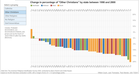
Another great breakdown of religious adherence in the US comes from a USA Today infographic on the matter. The page allows you to mouse over results and makes navigating the data easier, unfortunately it is not possible to imbed it on this website. Instead, I can upload some of the most interesting graphs as pictures here:

The rise of the Nones was most pronounced in the Northeast, where this article oddly places DC and Delaware in the South, I think they belong in the Northeast. The South saw No Religion grow the least. How about Catholicism?

Here we see the biggest growth in Catholics has been in states with high immigration from Latin America, like Arizona, Texas, and California. Every state in the Northeast and all but one state in Midwest has seen a decline in Catholic-identifying people. Things look worse from the remaining denominations of Christianity in the US:

Only Rhode Island and Louisiana saw growth here. Louisiana is interesting because it saw a 16% decline in Catholic-identified people during the same time, perhaps they converted to Protestantism or more likely, Hurricane Katrina reshaped the demographics of the state.

So where to most of the Nones in the US live?

Unfortunately one has to mouse over the bubbles to see the percentages, I can say that 34% of Vermont’s population identifies with no religion, while only 5% of Mississippi’s population does. Feel free to look at the infographic for complete results.

Something that surprised me was how many Northeastern states rank high on this list. The Western US has been labeled the “Unchurched Belt” yet many Northeastern states are less religious than California, or Arizona, for example. This may be due to a historic irreligiosity that the Western US states showed before the Northeast caught up. Here is a ranking of No Religion by state in 1990:

Here we see why the US West was considered the “Unchurched” part of America. Even Utah had a higher percentage of Nones than most non-Western states.

So what does all of this mean for the US, is America turning into an atheistic country? apparently not, according to polls of America’s Nones; a full 51% of US Nones believe in a God or a higher power. I think a better question is what effects will the surge in US irreligion have on the Culture War in the US today. One of the biggest issues relating to the Culture War in the US is gay rights. Gallup has a great article that summarizes Americans views on this. They found that for the first time in the US, the majority of respondents believe that gay/lesbian relations are morally acceptable. About 60% of men and women aged 18 to 49 find gay/lesbian relations acceptable, while only 44% of respondents over 50 find it acceptable. But this distinction pales in comparison to the importance of religion. Gallup found that 85% of No Religion respondents (Nones) find gay/lesbian relations acceptable. 62% of Catholics find it acceptable while only 42% of Protestants do. This makes the delta between US Protestants (51% of the US population) and the Nones (15% of the US population) more than 2 to 1, or 43%.

One of the most recent electoral outcomes relating to this was California’s Proposition 8, which banned gay marriage in 2008. The poll divided people on religious lines. One poll from the PRRI found that on Proposition 8:

“Solid majorities of Latino Catholics and white mainline Protestants, along with a majority of white Catholics, would now vote to allow gay and lesbian couples to marry, while solid majorities of African American Protestants, white evangelical Protestants, and Latino Protestants report that they would vote to keep same-sex marriage illegal.”

With this I want to conclude with an idea: maybe the lines of the US Culture War aren’t drawn between Red States and Blue States, maybe they’re drawn between the most religious Protestants and the Nones. It was hard to find statistics on Evangelical denominations of Protestant Christianity, but I’d bet its somewhere around half of the Protestant population in the US. That means that in 20 years, if the ARIS projections hold, the US will find itself culturally divided, with the Nones and conservative Protestants making up 40% of the population, the rest could be dominated by more moderate Catholics and mainline Protestants. If the “importance of religion” poll indicates anything, perhaps instead of Red and Blue states. the US is most culturally divided between the irreligious West and Northeast against the South and parts of the Midwest, where religion is more important to people.

News about  university rankings has taken an International Relations twist as the EU has angrily criticized two recent rankings and has allocated funding to create a new system. This was in response to a very low ranking of European universities by the UK publication Times Higher Education, and the Shanghai ranking. Having an emerging superpower like China view Europe’s universities so poorly has led to some European education ministers and university presidents to travel to China and express their concerns and promote their universities. Unlike domestic rankings of US universities (we call them colleges : ) have, these international rankings bring the prestige of a nation’s entire higher education system into scrutiny. It makes sense for countries like Germany and France to fret over these results, as both rankings make their  higher education systems appear to be inferior not just to the US model, but to one of the most eurosceptic members of the EU: Britain. The coalition government in Great Britain has been increasingly critical of European (read EU) integration, and the debt crisis has emboldened them continue to use a separate currency and avoid contributing to Eurozone bailouts (the UK is, by far, the largest EU member-state not to use the Euro). Lets see what these two rankings show:

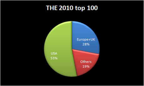
Of the top 100 from the Times Higher Education, here are some results and analysis: (note: I am lazy so the colors don’t match, sorry)

Immediately it is clear that the EUs higher population and GDP (EU-wide, not Eurozone) does not produce as many top 100 universities compared to the US. But this shows only part of the problem.

Half of Europe’s top 100 universities are in the UK, an impressive feat for a country with a smaller economy and population than Germany. The United Kingdom’s GDP and population figures are very closely matched with France who does terribly on this graph. see my link above for complete results.

Finally, when we include Irish, Canadian, and Australian universities lets see how they perform, as the Anglosphere:

Once you include important universities in Canada, Australia and Ireland it appears that the world’s most desired universities are overwhelmingly English-speaking establishments. Perhaps this ranking system favors that unfairly, it is an independent publication, but it is also a British, independent publication. Russia once had a ranking system that appeared reasonable at first glance, until one found Russia’s own Moscow State University ranked higher than Harvard or Cambridge. Lets see how China’s ARWU or Shanghai Ranking rates the same regions.

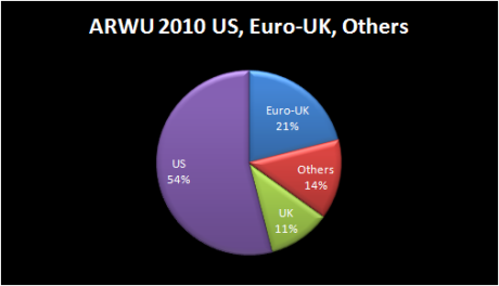
The Chinese ranking or ARWU has been out since 2003, but it wasn’t until its recent battering of European universities was combined with the THE ranking for 2010 that Europe responded. Here are the same regions being measured by the 2010 ARWU/Shanghai Ranking: (note: I excluded Moscow State University from Europe because Russia’s relationship with the EU is different than Switzerland or Norway’s)

While Europe clearly does better in the ARWU ranking, the US still dominates the top 100.

Separating Britain from the EU has a similarly bad outcome for Europe, though its not as bad for Europe as the THE rankings showed. To break it down more thoroughly: France has 3 universities compared with Britain’s 11, while Germany has 5, and Switzerland somehow ties with France with 3.

Both the ARWU and THE rankings clearly favor English-speaking universities, with both giving them at least 70% of the top 100 in both cases. The ARWU ranking doesn’t rank Irish universities in its top 100, but does rank Canada and Australia’s universities with 4 and 3 respectively. While one might expect China’s East Asian rivalry with Japan to color the ranking’s view of Japanese universities, this isn’t the case: Japan features 5 universities in the top 100, with no Chinese institutions included. Rounding off the list is Russia’s Moscow State University and Israel’s Hebrew University.

The ARWU has also been criticized for favoring sciences much more than humanities, which might explain why many liberal arts colleges perform badly on this list.

Personally, I think ranking an entire university is an incomplete science at best. It’s easy to rank a university’s prestige, but sometimes that prestige doesn’t reflect a particular program’s strength at a university. For instance, Georgetown and Johns Hopkins both have highly esteemed schools of International Relations and Diplomacy but lack the similar prestige of MIT’s hard science programs, so they lose out in a ranking that favors hard sciences. I’d rather not split hairs ad infinitum over ranking systems and instead focus on the IR implications ofthe recent ranking system debacle.

European integration has been viewed by some of its proponents as a means for Europe to remain relevant in an increasingly multi-lateral world. Don’t just take my word for it, academics have written much about it. French and German politicians and academics have been especially eager to use the EU to promote this goal, and as a consequence, have been equally insecure over its prospects. While the Eurozone’s economy is smaller than the US, the entire EU membership has at least matched it recently. This has led outsiders and Europeans alike to eagerly await an example of European leadership. One of these much anticipated examples ended in spectacular failure at the 2009 Copenhagen Summit on Climate Change.

Europeans anticipated this would be a moment where their divergence with the US on climate change could help to underscore Europe’s relevance as an ec0-friendly alternative to US or Chinese dominance; this made the summit’s outcome exceptionally embarrassing. Prior to the opening of the summit itself was a smaller summit within the summit, where Obama negotiated with China as well as Brazil, India, and South Africa. After the summit appeared to be faltering, it was only efforts by China and the US to reconcile their differences with one another that was able to produce a final draft agreement. This was witnessed at the horror of EU enthusiasts, as it confirmed their worst fears of a world dominated by the G-2 (China and America). The fact that Europe’s failure at the summit may have been planned in advance can only add to the frustrations of European leaders. China’s importance at the summit put European aspirations of global leadership in doubt. The Eurozone debt crisis hasn’t helped matters, with Standard & Poor’s recently downgrading Greece’s sovereign debt to one of its lowest ratings.

It might seem like a poor ranking from two subjective lists shouldn’t bother European politicians and university heads as much as it has, but within the context of an increasingly desperate Eurozone debt crisis and a larger global shift towards the BRIC (the IMF predicts China’s GDP in PPP will overtake the US by 2016) it seems reasonable for such insecurities to exist.

One thing I’ve always been impressed with was regional identity in Rap music. Regional identity is not uncommon in other genres of music but it seems especially present in Rap (or hip hop but I hate calling it that). I don’t listen to or care about Hardcore music or other genres to be able to explain their regional variation/identity but I’ve found some interesting things w-r-t rap in the US.

I feel like I did an adequate job defining most rap regions, I’m not 100% sure Norcal should have gotten its own region and not Detroit/Pittsburgh but giving a single city a region seemed unfair. At the same time, most East Coast comes from NYC and most West Coast comes from LA. Tell me what you think.

Here’s a list of really cool albums/tracks in the rap/hip hop genre

Low Budget – Crunk in Yo System (seriously the best comp for southern rap)

The Weeknd – House of Balloons (indie hip hop)

Wiz Khalifa – Youngin’ on his grind.

Big K.R.I.T. – Country Shit (Remix) ft. Ludacris & Bun B.

more to come

recently I wrote about the trend of low HDI scores in the US South and Appalachia. This time I want to focus on a metric found from the same source. The metric of life expectancy from birth is actually a good way of comparing US congressional districts to other countries.

The CIA World Factbook has a listing of most nations’ average life expectancy from birth here. It’s important to note that because this is an actual year-based estimate, the rankings for congressional districts and countries is tightly ranked, and misreporting statistics from developing countries is a possibility. I want to stress that these are averages so while someone living 2 years less might not seem like much, but this is the result of everyone in a district/country living longer or shorter lives. Some of these statistics will make you question the world.

While I’ll mention the regional disparity briefly, I’d like to focus on the comparison of life expectancy with certain US congressional districts (CDs) and other countries as well.

Here is a map of the bottom 100 CDs in the US:

Many things stand out compared to the HDI graph representing the bottom 100, though the US South+Appalachia region is similarly represented in this map.

Firstly, the West Coast does considerably better than the East Coast, with only a single CD making the list west of Texas. Second, cities in many Eastern States have lower comparative life expectancies than their HDI suggests. Regions of the Rust Belt including North Ohio and the Detroit metro area score poorly. The mid-Atlantic cities Philadelphia and Baltimore do poorly, but the rest of the Northeast does well.

This map shows the bottom 25 districts in the US, these districts only live 72 to to 75 years on average (I’ll provide a complete table of average life expectancy later).

Much like the bottom 25 districts by HDI, the bottom 25 in life expectancy are almost all inside the US South and Appalachian regions. The Mississippi embayment and the Kentucky-West Virginia border are the worst hit.

Here is a listing of the bottom 100 districts by age. But I’ve added a column for countries with similar life expectancies for the bottom 50. I got these numbers here and here.

West Virgini 3 72.9 Egypt 72.66
Kentucky 5 73.6  Thailand 73.6
Mississippi 2 73.6 Bulgaria 73.59
Alabama 4 74.3 Serbia 74.32
Pennsylvania 2 74.4 Mauritius 74.48
Oklahoma 2 74.5 Algeria 74.5
Pennsylvania 1 74.5 Colombia 74.55
Georgia 2 74.6 China 74.68
Alabama 3 74.7 Syria 74.69
Alabama 7 74.7 Cook Islands 74.7
Louisiana 7 74.8 Hungary 74.79
Arkansas 1 74.8 Tunisia 75.01
Tennessee 8 75.0 Lebanon 75.01
Tennessee 9 75.0 West Bank 75.01
Mississippi 3 75.0  Macedonia 75.14
North Caroli 1 75.0 Tonga 75.16
Louisiana 5 75.0 ” “
Arkansas 4 75.1 ” “
Georgia 1 75.1 ” “
Missouri 8 75.1 ” “
Alabama 1 75.1 ” “
Georgia 8 75.1 ” “
Mississippi 4 75.2 ” “
South Caroli 6 75.3 Lithuania 75.34
Florida 4 75.3 ” “
Louisiana 4 75.3 ” “
Mississippi 1 75.4 Antigua and Barbuda 75.48
Georgia 12 75.4 ” “
Arkansas 2 75.4 ” “
Michigan 13 75.4 ” “
Michigan 14 75.4 ” “
Kentucky 1 75.5 ” “
Maryland 7 75.5 ” “
Louisiana 6 75.5 ” “
District of Columbia 75.6 ” “
Louisiana 1 75.6 ” “
Oklahoma 4 75.6 ” “
South Caroli 5 75.7  Ecuador 75.73
Louisiana 3 75.7 Croatia 75.79
Alabama 2 75.7
Alabama 6 75.7
Tennessee 1 75.7
Virginia 9 75.7
West Virgini 2 75.9  Morocco 75.9
Louisiana 2 75.9
Tennessee 4 75.9
Oklahoma 5 76.0  Poland 76.05
North Caroli 7 76.0
Oklahoma 3 76.0
Oklahoma 1 76.0
Virginia 3 76.0
Alabama 5 76.1
Texas 1 76.1
Ohio 6 76.2
Kentucky 4 76.3
Illinois 12 76.3
South Caroli 3 76.3
Texas 13 76.4
Tennessee 7 76.4
Virginia 4 76.5
Georgia 3 76.5 Mexico 76.47
Texas 8 76.5
Michigan 5 76.6
Tennessee 6 76.6
Kentucky 3 76.6
Tennessee 3 76.6
Indiana 7 76.6
Texas 5 76.6
Michigan 11 76.7
North Caroli 10 76.7
Missouri 5 76.7
West Virgini 1 76.7
North Caroli 3 76.7
South Caroli 4 76.7
Texas 19 76.8
North Caroli 8 76.8
Texas 2 76.8
Georgia 11 76.9
Ohio 15 76.9
North Caroli 2 76.9
Maryland 3 76.9
Indiana 1 76.9
California 2 76.9
Georgia 10 76.9
Maryland 2 77.0
Ohio 17 77.0
Ohio 9 77.0
Missouri 4 77.1
North Caroli 5 77.1
Virginia 5 77.1
Kansas 4 77.1
Indiana 8 77.1
Wisconsin 4 77.2
Missouri 3 77.2
Tennessee 2 77.2
Ohio 10 77.2
Ohio 11 77.2
Tennessee 5 77.2
Indiana 6 77.2
Texas 14 77.2

Surprisingly, many countries perform better than US congressional districts. Eastern Kentucky has the same life expectancy of someone in Thailand, think about that for a second. Not only are parts of the US much lower than the US average, they’re actually much lower than most developed countries. The US  ranks 50th overall on the CIA World Factbook, th0ugh a number of meaningless micro-states and dependent territories distort this ranking somewhat. US life expectancy raises many important questions about access to healthcare and our dietary habits among other things.

Finally, I want to point out that some of these statistics are hard to accept. Jordan ranks higher than the Netherlands, for example. and Bosnia, despite its violent recent history has a higher life expectancy than Denmark. I’m not necessarily accusing these countries of outright dishonesty, but perhaps their methodology was vulnerable to inaccuracies. There are hundreds of thousands of Bedouin in Jordan, many of them weren’t born in hospitals so its possible that age estimates could be wrong. This isn’t the first time I’ve suspected this, in a much earlier blog on female literacy I found that the country of Georgia claims 100% literacy, despite having a GDP per capita lower than Syria, and a very rare and complicated language, in addition to smaller languages like Tsez being spoken. Take these statistics for what you will, its intriguing no less.